
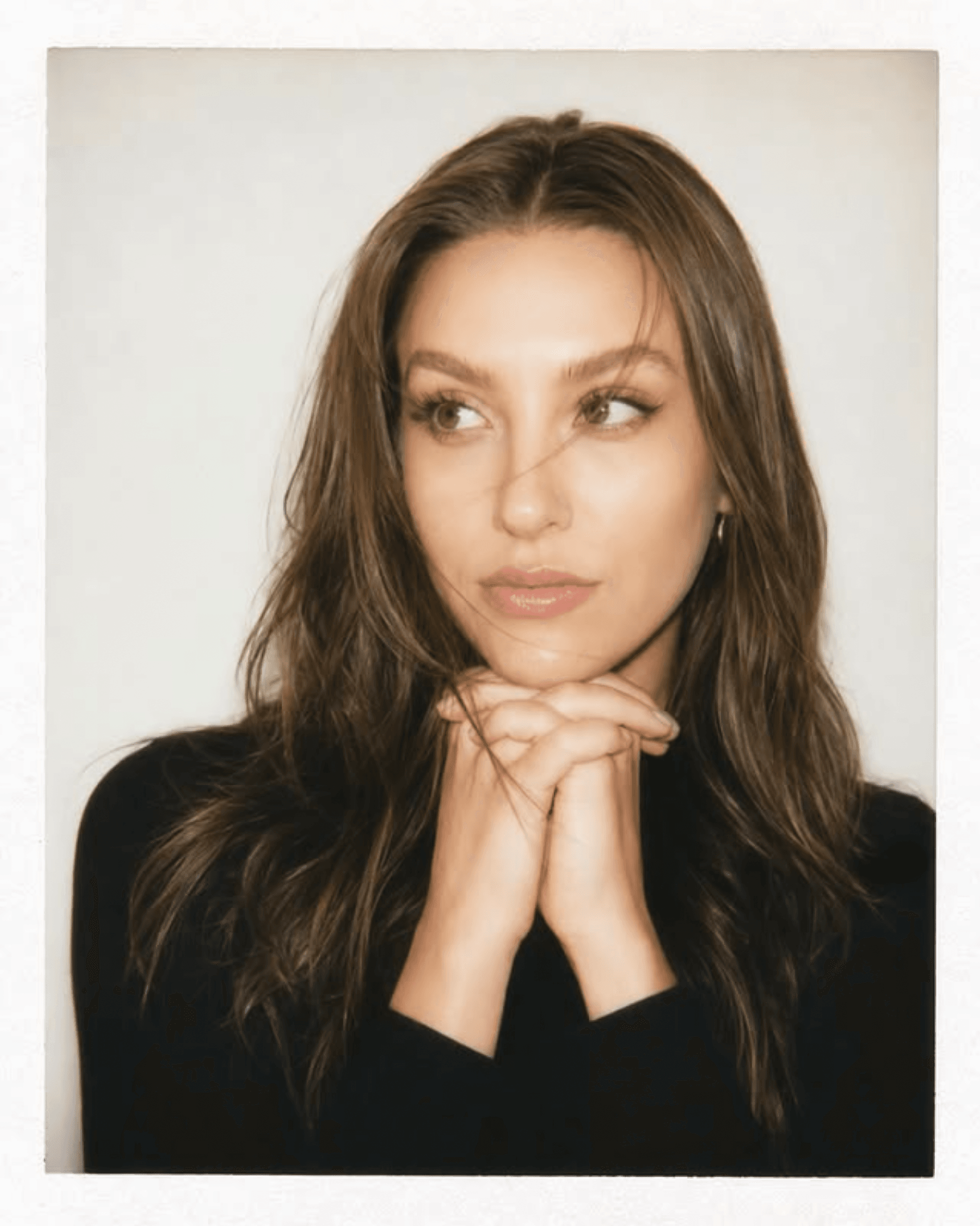
Maggie Bowles has built a career too expansive for a single line on a business card. She is Chief Brand Officer at real estate development firm Precedent, founder of creative agency Bujou Studios, a painter since the age of seven who only began exhibiting publicly this year, and the designer behind the rebirth of Naked Revival as it moves toward an IPO. Here, she traces the philosophy connecting each discipline, the vulnerability of bringing her paintings into public view, and what it means to build something that feels truly authored.
Your Identity as a Creative
QYou describe yourself as a ‘multidisciplinary creative’ and that feels deliberate. When did you first realize that no single label fit what you do, and how has owning that identity changed the way you work and the clients you attract?
I have always been suspicious of neat little titles.
They are useful, of course. They make email signatures tidy and create a box that is understandable and clear. But for me, they have always felt a bit like wearing someone else’s coat: technically functional, but never quite cut for my body.
For years, I was called every version of a creative title you can imagine. Creative director. Marketer. Designer. Strategist. Artist. Founder. At one point, someone called me a “professional creative person,” which is delightfully peculiar and, unfortunately, fairly accurate.
The phrase multidisciplinary creative comes from more of an evolution than an intentional decision. It was something I arrived at after realizing that most titles only described one surface of the work, and I have never been particularly interested in fitting into just one place.
I remember this becoming painfully clear in the early days of Bujou, when we were ordering our first business cards. There is something almost comical about trying to reduce yourself to one line of text and having one little rectangle being such a huge crisis of identity and operational clarity.
I was searching things like “job titles for people who do more than one creative role,” which now feels hilarious and a little tragic. Nothing fit. Everything felt either too corporate, too inflated, too vague, or too small. We tried a few. Chief Creative Officer stayed for a long time. Chief Brand Officer is my current title with Precedent.
Eventually, I realized I wasn’t having an org chart problem. I was having a category problem.
My work has never lived neatly in one discipline because I don’t really see creative work in pieces. I can’t separate the logo from the world it belongs to, or the campaign from the person it is trying to seduce, or the room from the way people should feel when they walk into it. I’m always thinking about the whole ecosystem.
That is the part I care about most. Not just how something looks when it is finished, but the years of judgment underneath it. The references, restraint, instincts, and strange little decisions that make something feel unavoidable instead of merely well-executed.
Owning the identity of a multidisciplinary creative changed the way I work because it gave me permission to stop making my range more digestible. I no longer feel the need to separate the strategist from the artist, or the creative director from the founder.
I also think it helped edit the clients we attract. Our “right client” tends to be building something with dimension: a brand, a space, a company, a story, a world.
That is where I am most myself. In the overlap. Somewhere between intellect and instinct.
So yes, multidisciplinary creative is deliberate now. But at first, it was just the only phrase that didn’t ask me to leave half of myself outside the room.
Twenty-Three Years of Painting
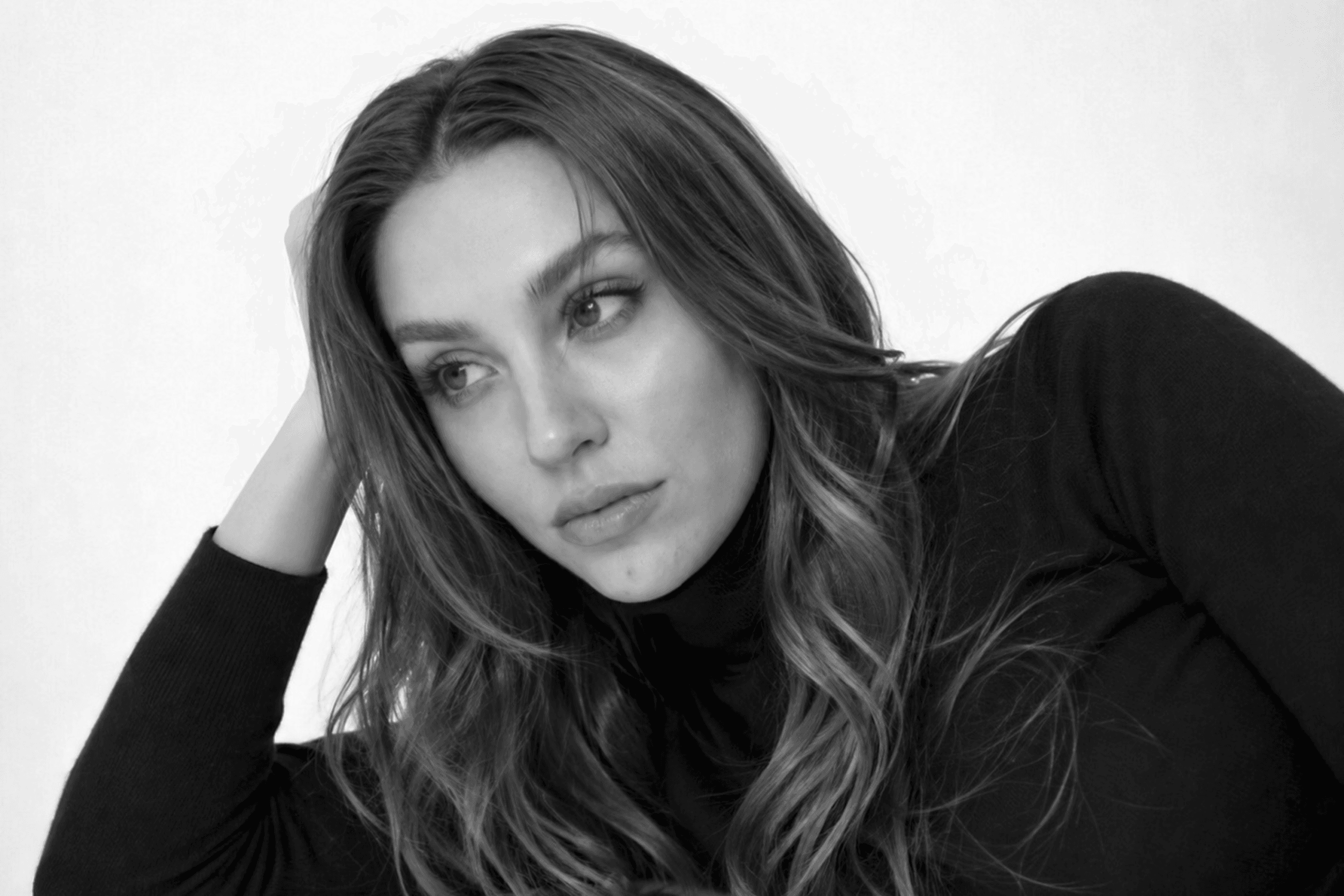
QYou’ve been painting since you were 7 long before any of the branding, design, or strategy work. How does that foundation in fine art quietly shape everything else you build? Do your clients ever see it, even when they don’t know it’s there?
Painting was the first place I learned that beauty has logic. Long before branding, design, or strategy became part of my professional life, I was studying why certain things felt resolved, why others felt unfinished, and how colour, composition, tension, and restraint impacted the piece.
I started painting when I was about seven or so, so for most of my life, fine art has been my outlet for training my perspective long before I ever considered it in a commercial sense.
I think fine art forces you to build a perspective. Not just a style, but a real point of view. When you spend enough time with it, you start to understand what you are drawn to, what you are rejecting, who has influenced you.
It also teaches you experimentation in a way that is very difficult to fake. Painting is a constant negotiation between control and accident. It makes you very comfortable with trial and error, and with breaking down process.
That has absolutely shaped everything else I build. When I am working on a brand, a campaign, a space, an image, or a concept, I am still bringing that same fine art brain into the room.
I think clients absolutely see it, even when they do not know that is what they are seeing. They feel when something has a stronger point of view. They feel when the choices are not just aesthetically pleasing, but considered.
Fine art gave me the foundation for that. It taught me that beauty is not just taste, and taste is not just preference. It is pattern recognition. It is discipline. It is study. It is the ability to understand why something lands.
Beauty is not just taste, and taste is not just preference. It is pattern recognition. It is discipline. It is study.
The First Public Collection
QUntil March 2026, your paintings had only ever been seen by family and friends. Then came the charity gala auction and everything changed. What did it feel like to put your work in front of a public audience for the first time, and what pushed you to finally do it?
There is always a strange little anticipation around doing something for the first time, but this was a very specific kind of first.
I have spent more than a decade putting creative work into the world through campaigns, brands, imagery, concepts, and spaces. But painting felt different because it had always belonged to a more private part of me.
Until the gala, my paintings had really only been seen by family and close friends. So it was special to be in the room and watch people respond to the work in real time. Not as a client project, not as a campaign, but just for what it was.
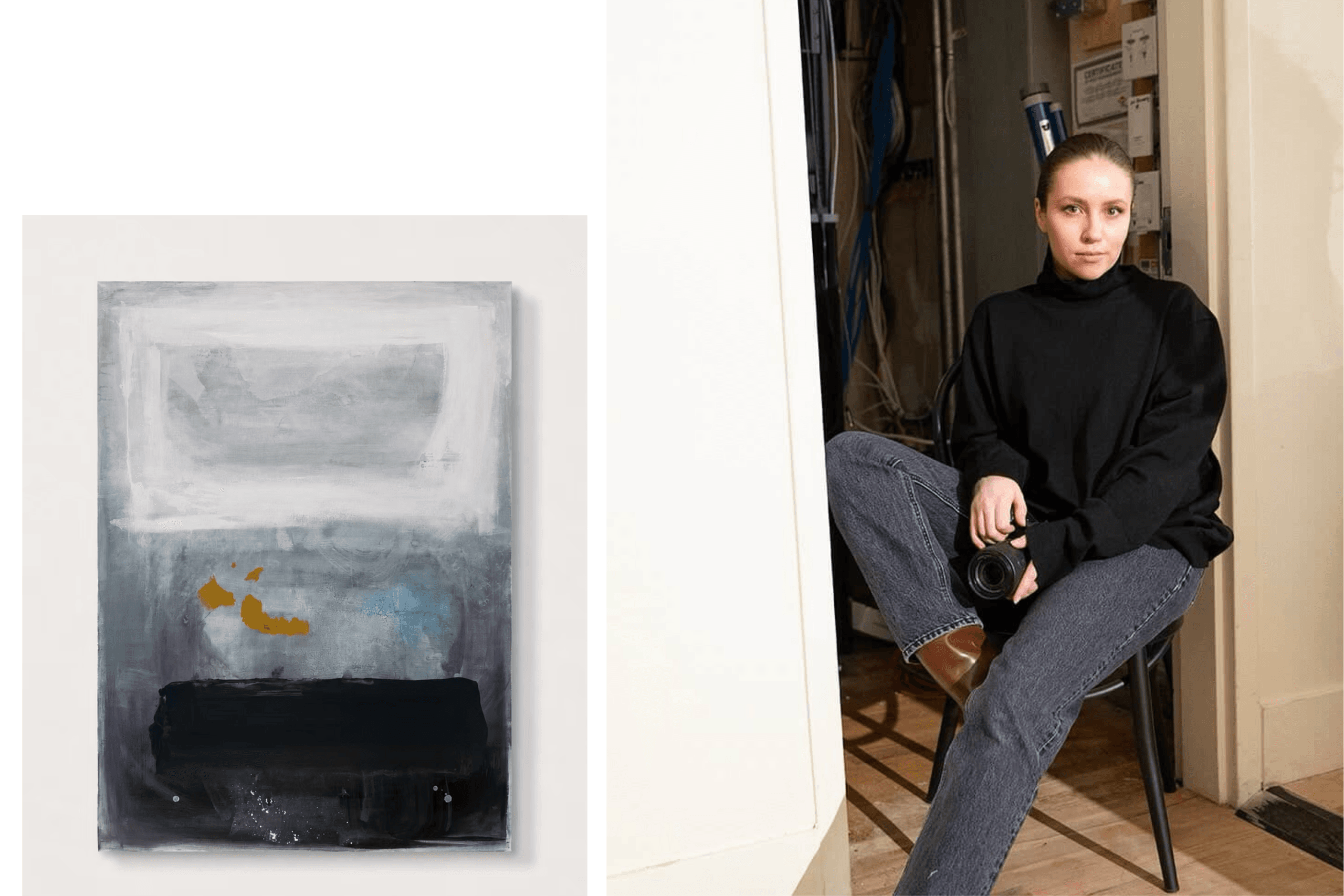
The work I showed was Brain Fog, which was auctioned off to my dear friend (and one of my favourite photographers), Steven Allen. I was a little nervous about putting that piece forward because it is so minimal. But it ended up being so warmly received.
The push to finally do it came from a few places. My business partner, Russell Petiot, was very insistent that I put a piece into the auction. We had also been developing an Artist Mentorship Program with local artist Miranda Moll, who has been the first artist to go through the program with us.
Miranda had three pieces in the same auction, and Russell made the very fair point that if I was helping other artists take their work seriously in public, I probably had to be willing to do the same with my own. Annoying, but correct.
The proceeds were also being donated to the Calgary Neuropathy Association, which made it very hard to say no. It stopped being about whether I felt perfectly ready, and became more about whether this was a meaningful reason to begin.

The System Behind the Creativity
QYou’ve described your creative philosophy as believing the system for creating is largely the same across mediums it’s just how it’s applied that shifts. Can you break that down? How does developing a brand and designing an interior actually follow the same path?
If you zoom out far enough, the creative process is remarkably similar across mediums. The materials change, the scale changes, but the underlying system is often the same.
Every project begins with trying to understand what the thing needs to become. What is it? Who is it for? What does it need to make someone feel? Those questions apply whether I am developing a brand, shaping an ad campaign, designing an interior, or painting a piece.
Then comes concept, which is where things start to loosen up. In painting, that might look like sketching, colour studies. In branding, it might be language, typography, positioning. In interiors, it might be material palettes, lighting, layout.
To me, those are not separate acts. A font has weight in the same way a chair has weight. A colour palette creates mood in the same way lighting creates mood.
Then comes refinement, which is often where the real taste lives. Refinement is where you make the work feel intentional instead of assembled.
So when I say the system is largely the same across mediums, I mean that the process of creating has a recognizable architecture. The difference is whether the final form is a campaign, a room, a painting, a brand, or a building.

Bujou Studios and Precedent Developments
QYou and your co-founder have built two very distinct companies a creative agency and a development firm. How do the two inform each other? Are there moments where a project blurs the line between both worlds completely?
I think Bujou and Precedent are much more connected than they may look from the outside.
Bujou Studios was built as a creative agency, but over the years we became especially strong in real estate, hospitality, and lifestyle-driven spaces. We have been awarded Canada’s Top Real Estate Marketing & Advertising Agency for the last four years.
At a certain point, that naturally raised the question: if we are this good at helping other people build desire around places, what happens when we start creating those places ourselves?
Precedent really came from that next layer of thinking. It is a development firm, but the creative lens is very present. We are thinking about the story, the feeling, the market, and what makes it commercially and culturally compelling.
The two companies inform each other constantly. Bujou gives Precedent the ability to think about positioning and narrative from the beginning. Precedent gives Bujou a much deeper understanding of what it actually takes to bring a physical space to life.
There are absolutely moments where the line between both worlds disappears completely. A few years ago, we started offering what we call Branded Interiors, which is probably the clearest overlap.
So yes, the line blurs all the time. Very deliberately.
Naked Revival
QNaked Revival sounds like a genuinely rare opportunity reviving an iconic brand from scratch, hand-drawn identity, now prepping for IPO. What does it mean to be the designer who brought something back to life? And what’s the pressure like as they move toward a public listing?
Naked Revival is really one of those truly unique and exciting projects.
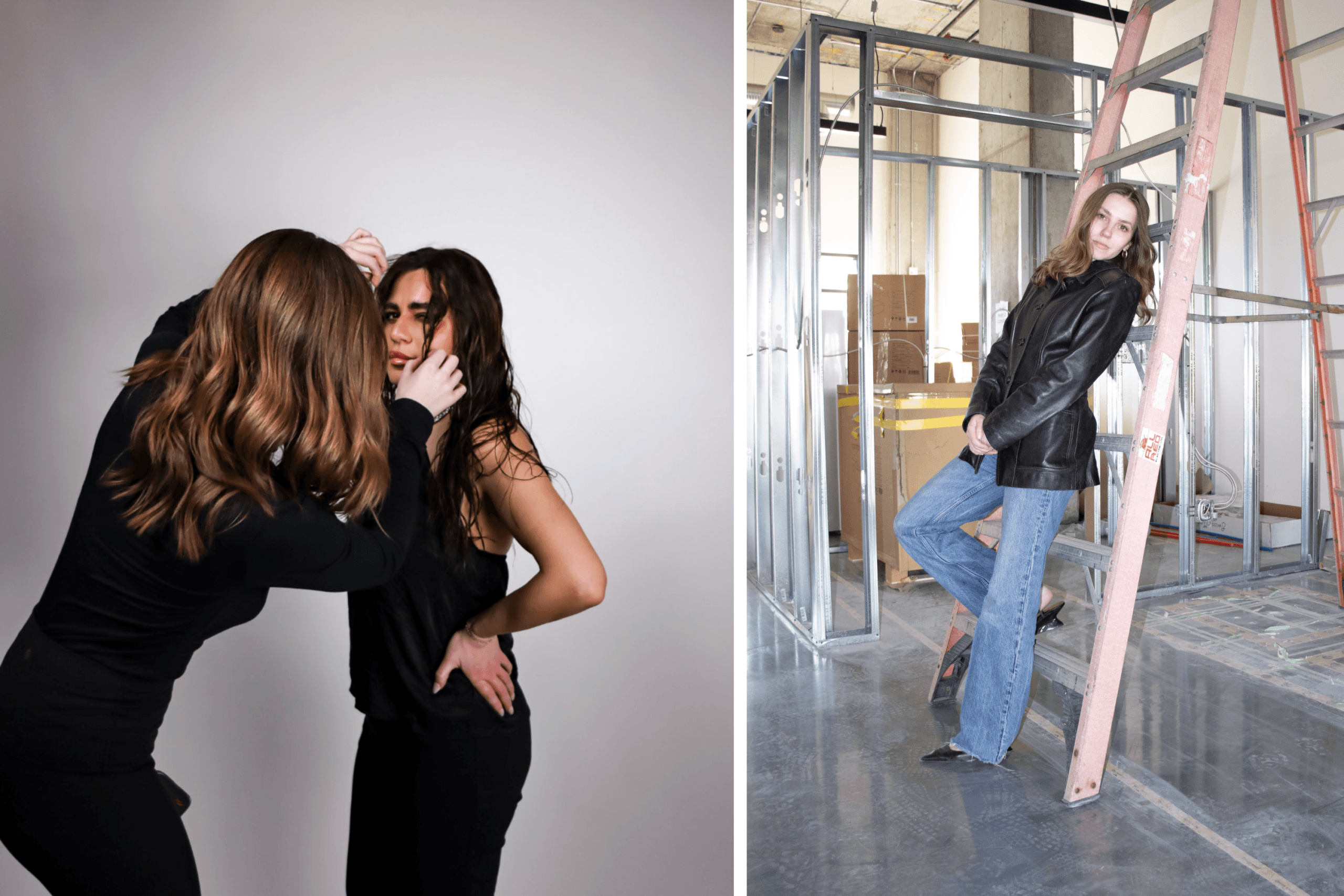
The brand already had a past life. Joel had built Naked Underwear (the ‘it’ underwear brand of the 2010’s) into something people knew, wanted, wore, talked about. So, when I came into the project, it was not about inventing a story from nothing.
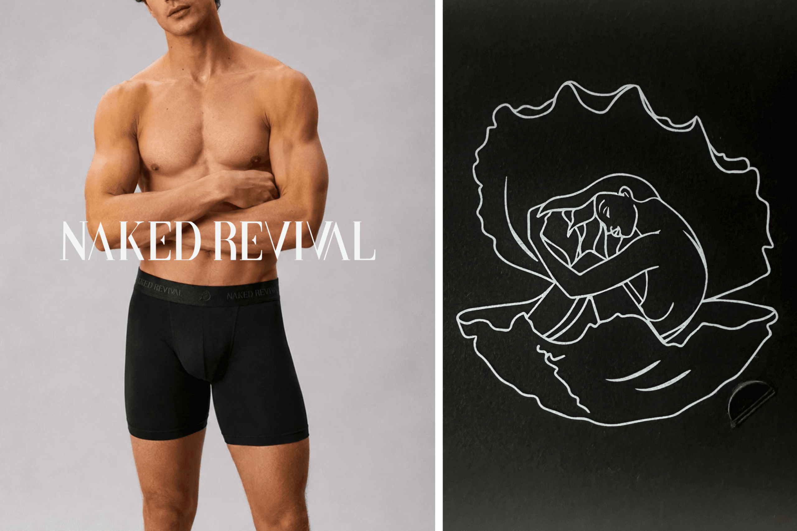
I had the privilege of developing the entire brand identity, but the work went much deeper than the logo. I worked on the identity, designing the underwear itself, creating the packaging, and developing the full customer experience.
The hand-drawn logo became one of the most important pieces of the brand. She organically developed the name ‘Shell Girl’. The icon depicts a naked woman sitting inside a clam shell, and she carries the emotional tension of the whole brand.
She was also one of the most difficult pieces of design I have ever developed. There is a very fine line between sensual and obvious, iconic and overworked, intimate and uncomfortable.
We think about Shell Girl almost the way Burberry thinks about the knight on the horse. She is not decorative. She is the emblem. The shell protects her, frames her, supports her.
That is where the brand becomes much more interesting than “men’s underwear.” It is really about health, confidence, identity, and the body. I think health is the truest form of luxury.
As Naked Revival moves toward IPO, there is obviously more visibility around every decision. But I do not really experience that as pressure in the anxious sense.
Joel is also an incredible founder to design for because he understands story and he trusts my vision enough so he had my design tattooed on him haha. Joel is also developing a documentary series sharing the whole process of bringing it back to life.
I think health is the truest form of luxury not in the wellness-buzzword way, but in the very real sense that feeling good in your body is foundational to how you move through the world.

Criminal Justice, Political Science and Fine Art
QYour academic path IB Fine Arts, a Criminal Justice degree, an MPhil in Political Science is an unusual combination for someone running a creative agency and development firm. How do those disciplines actually show up in your work?
My educational path has definitely been unusual, but I think it makes a lot of sense once you understand how my brain works.
I started studying art so young that I had plenty of time for people to tell me I would never make any money doing it. So, very practically, I started looking for a career path that felt creative enough to keep me interested and serious enough to be considered responsible.
Architecture was the first obvious choice, until I accepted that I have never been a math person. Then, after winning a mock trial in grade eight English class, I decided law had a better dramatic arc.
Criminal Justice became my pre-law degree. What I was really learning was how to investigate systems. How power moves. How a narrative can change depending on who is telling it.
Political Science took that even further. It made me much more interested in why people believe what they believe, and why certain structures become accepted as normal.
That shows up constantly in my work. In branding, because brands are not created in a vacuum. In development, because spaces are never neutral.
And then fine art is the foundation underneath all of it. That is where the eye comes from.
What’s Next
QYou have the hotel conversion, the Wave Health clinic launching later this year, the new painting collection, and Naked Revival heading toward IPO all at once. Where do you want to take things in the next few years? Is there a version of Maggie Bowles’s work that you haven’t built yet but can see clearly?
I think the next few years are about scale.
Not just doing more, but building at the level I know my taste and instincts are capable of operating. From the outside, I understand why that might look like a lot. To me, it looks like the beginning of the work finally matching the size of the vision.
I have never been interested in being excellent at one small thing. I am much more interested in building worlds: brands that become spaces, spaces that become cultural experiences.
The hotel conversion is a huge piece of that. Wave Health is similar in a different category it is a chance to make healthcare feel current, considered, and culturally relevant.
The painting collection matters because it brings my fine art practice into the same public conversation as my commercial work.
I am interested in building things that feel authored. That is the word I keep coming back to. Not just designed, not just marketed, not just developed, but authored.
I do not think I am trying to discover what my work is anymore. I think I know. Now I am building the version of it that has enough space, budget, ambition, and permanence to hold the full thing.

A Message to Other Multidisciplinary Creatives
QThere are a lot of people who work across multiple disciplines but struggle to be taken seriously across all of them they get boxed into one lane. What would you tell them?
If you can’t fit into a box, make your own.
I know that sounds simple, but I think it is the entire answer. A lot of multidisciplinary creatives spend years trying to explain themselves in a language that was built for specialists.
If your range is real, you have to build a structure that can hold it. The box does not have to exist before you arrive. You are allowed to build it around yourself.
I take a lot of cues from people who were never just one thing. Karl Lagerfeld was not just a fashion designer. Andy Warhol might be the ultimate example. The overlap was not a flaw in the work. It was the work.
Being hard to categorize is only a problem if you let other people frame it as confusion. If you frame it properly, it becomes authorship.
That does not mean you should be vague. You still need a point of view. You still need taste. You still need proof.
So my advice is: stop waiting for the existing categories to become generous enough to hold you. Build something more accurate. And then keep going long enough that what once made you hard to explain becomes the reason people come to you.

Connect with Maggie Bowles
Chief Brand Officer · Precedent · Bujou Studios · Naked Revival
Maggie Bowles is Chief Brand Officer at Precedent Developments and co-founder of Bujou Studios, Canada’s reigning Top Real Estate Marketing & Advertising Agency. She is also the designer behind the relaunch of Naked Revival, currently heading toward IPO.
“If you can’t fit into a box, make your own.”